Cycad overview
CYCling Autocorrelation Dataviz
Cycad is a library for visualizing the autocorrelation from in situ battery cycling meaurements such as X-ray diffraction (XRD) or X-ray absorption spectroscopy. In this documentation, XRD data will be assumed unless otherwise specified.
The motivation for cycad to clearly show the relationship between battery cycling data at different stages. It does this by calculating the correlation between each pair of measurements in an in situ dataset and plotting it as a heatmap.
- Installation
How to install cycad
- Tutorial
Learn how to use cycad
Reading cycad plots
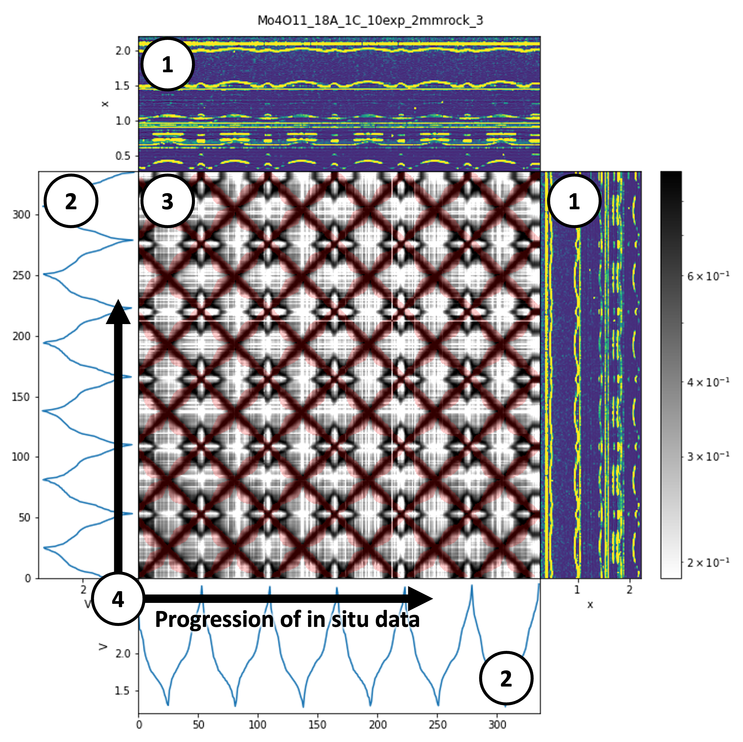
Subplots labelled (1) show heatmaps of in situ XRD data in two different orientations.
Subplots labelled (2) show plots of the cycling voltage in two different orientations.
The main subplot (3) shows two datasets. The underlying plot in grayscale show the Pearson correlation between each pair of measurements in the dataset, with darker regions showing greater correlation (similarity between patterns). The overlaid plot shows a translucent red region that corresponds to pairs of measurements for which the voltage is within a certain range.
The progression of in situ data (4) are left to right / bottom to top. The plot is symmetric around the bottom-left to top-right diagonal.
Interpretation: for a material with stable cycling, similarity between patters should correspond to similar voltages, so the red region should overlay the darker regions below.
How cycad works
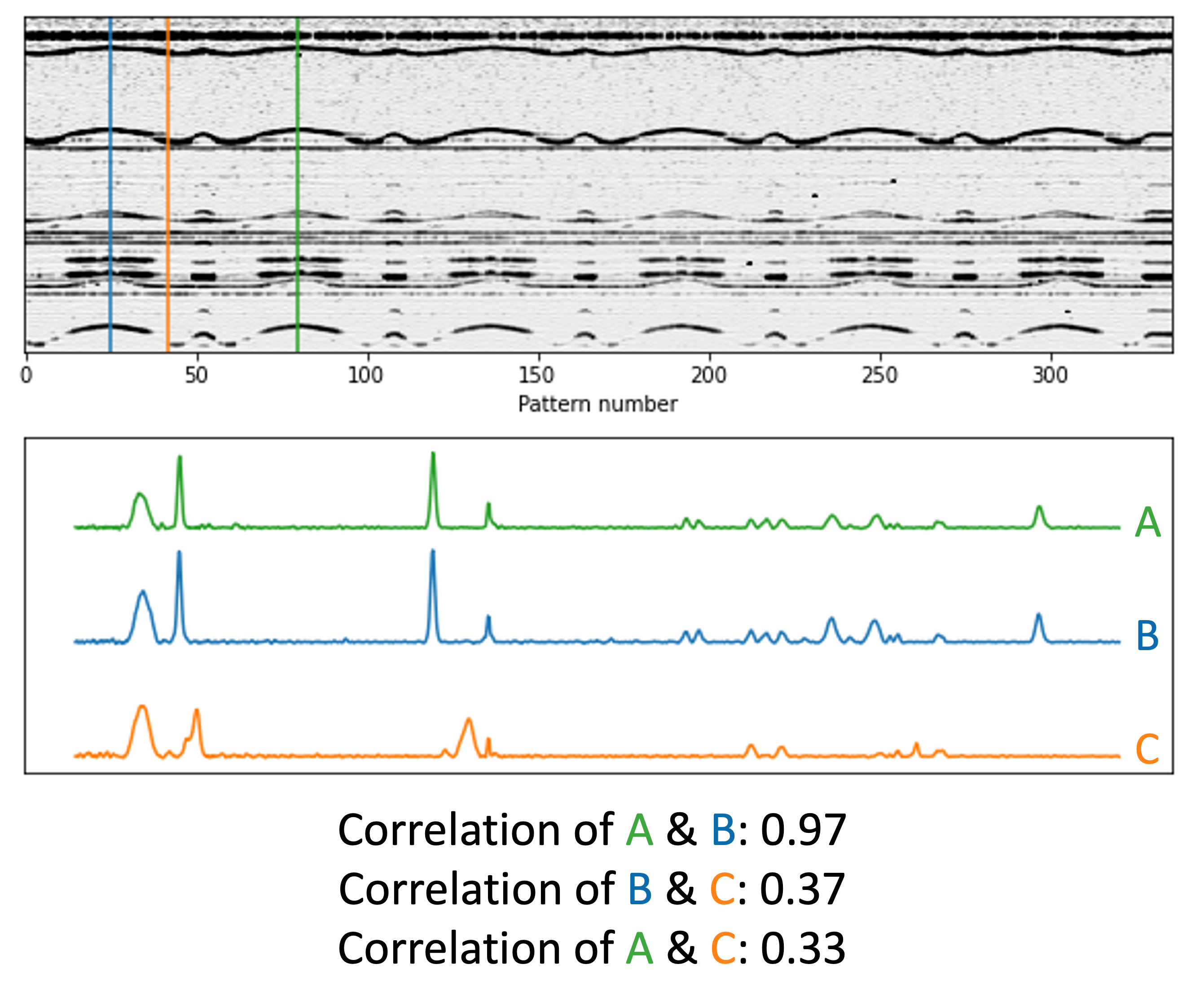
Each pixel of the main cycad plot (3) is a Pearson correlation coefficient between two measurements - i.e. how similar they are. Correlation is on a scale of 1 to 0, where perfect similarity has a correlation of 1. This figure gives an example - two patterns at similar points on the charge/discharge cycle have a correlation of 0.97, while patterns at dissimilar points have a much lower correlation of < 0.4.